Initially, I thought I could try make an argument for the value of book jackets as a language, as a shorthand that is as useful as it is consistent. As the most perfect visual representation of literature outside of typographical visuals.
And then I did some research and realised that that would be an outrageous lie.
Book jackets are occasionally useful, in the sense that car insurance is: you pay for it all the time, but it turns out to be handy once or twice in your lifetime. Most of the time, it’s money down the drain for a service that is more disappointing than useful. So, you may have heard some of these arguments before, and if you haven’t, then I am glad to be somewhat informative.
I’ve written before about the constant whitewashing of book jackets, with black characters suddenly paling and becoming acceptable to the consumer’s eye, and there is the endless use of sad, skinny girls on YA book covers. Book covers are a language, not just for the consumer but for the bookseller. And like any language, it is prone to miscommunication. It’s easy at first glance to be like “oh, that’s a serious, manly literary tome about life and death and cigarettes” or “that’s obviously chick-lit, it has a lady on the front with her back to us and soft fuzzy colours”. Book jackets are a shorthand and a guide, and are both reflective of their time and their publishers. As such, they can be immensely revealing or completely obtuse.
But how is a jacket made, you may ask? Book jackets fall into two categories: careful and careless. More often than not, the book jacket is designed based on the blurb and maybe an extract. Maybe. Most book jacket designers do not even get to read the book, and end up using stock images rather than crafting a jacket that is informed and enriched by the book’s contents. (You’d be amazed how much this applies even outside of traditional publishing.)
Occasionally, you get a book that has a lovingly-made jacket, and in South Africa, 99% of the time that jacket has been painstakingly crafted by the magnificent Joey Hi-Fi, a man of prodigious talent. If you’ve seen a local book jacket you’ve liked, it was probably done by Joey, whether it is Louis Greenberg, Lauren Beukes, or Imraan Coovadia.
In an interview about his book design process, Joey Hi-Fi said:
My conceptualisation process starts with me reading the novel. I always do this before starting work on a book cover. And in the rare cases that I cannot (for example: the book is still being written or is in a foreign language) I ask for a detailed synopsis and to chat to the author.
I’ve never felt comfortable just working off a brief from the editor or marketing.
Behold, a very small sampling of his artwork:


And glory be to Sir Hi-Fi, because most of the time, we just get this:
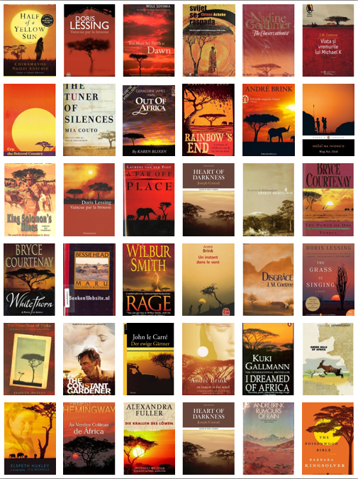
This is from the amazing site Africa Is A Country, about that goddamn acacia tree that is meant to represent all of African literature forever, regardless of the origin of the author or the plot of the novel. Quartz expanded on this, giving the awful truth as to why this happens:
Of course, there are the deeply ingrained problems of post-colonialist and Orientalist attitudes. We’re comfortable with this visual image of Africa because it’s safe. It presents ‘otherness’ in a way that’s easy to understand. That’s ironic, because what is fiction if not a way for you to stretch your empathetic muscles?”
This discussion caused something of a foofaraw in the book industry, just like the genderflip discussion that started earlier this year about how incredibly gendered and awful book jackets are for women’s books. In this long, brilliant and funny essay, YA author Maureen Johnson discusses why women’s books are deemed fluffy or light or breezy, and men’s books aren’t, and how that has something to do with obviously gendered book jackets.
You are informed about a book’s perceived quality through a number of ways. One of those ways is the cover. The cover may be the biggest message-bearer. Other messages include: blurbs (who they are from), comparisons, review coverage, store placement, and categorization.
And the simple fact of the matter is, if you are a female author, you are much more likely to get the package that suggests the book is of a lower perceived quality. Because it’s “girly,” which is somehow inherently different and easier on the palate. A man and a woman can write books about the same subject matter, at the same level of quality,and that woman is simple more likely to get the soft-sell cover with the warm glow and the feeling of smooth jazz blowing off of it.
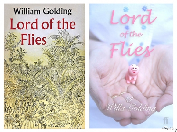
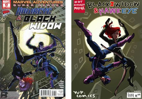
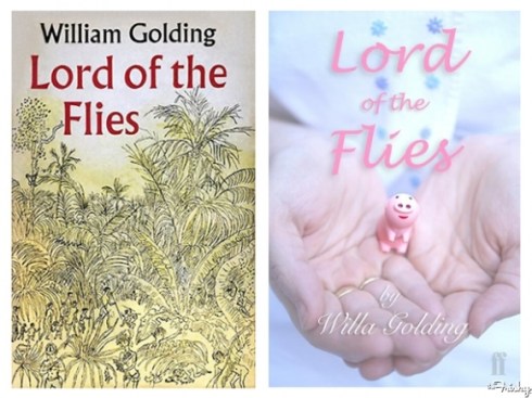
Johnson then put out a challenge on Twitter to get some genderflipped covers and the internet took up this cause with such gusto that it made me rather happy. Some of the genderflipped examples below: (images link to original source, please go support!)

On a similar note, The Oatmeal drew Spiderman the same way the new Spider Woman is drawn. It is glorious (and somewhat not safe for work).
We don’t have to have shitty covers that tell us nothing about the book. It shouldn’t be a case of only a bunch of privileged old white guys who get interesting jackets (Franzen, Eugenides, McEwan, Pynchon, etc), or a few very lucky debuts (Edan Lepucki, Erin Morgenstern), but it is. Inappropriate and inadequate book jacket design is the norm, not the exception. And if you think this isn’t important, remember that bad cover design belittles a book.
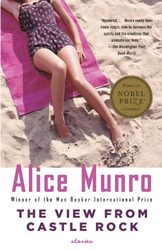
If you take a look at the cover of Alice Munro’s latest Nobel Prize-winning short fiction collection, The View From Castle Rock, you probably wouldn’t guess it includes stories about cholera, the death of an infant, and domestic abuse. The cover, featuring pink lettering and a neck-down shot of a woman suntanning on a pink towel, suggests it’s a breezy summer read–and not one meant for men. – How Tarted-Up Book Covers Belittle Women’s Fiction
Bad cover design delegates books to the wrong sections, gives them the wrong or no readers and so often puts great books on sale tables, alone and unwanted and left to die next to untold numbers of Dan Brown books. We can’t help but judge books by their cover: we don’t have the opportunity and time to read every goddamn blurb or review. Customers and booksellers judge books by their cover, and we’re basing our purchasing decisions on the rushed work of an underpaid, uninformed and overworked designer. Sure, sometimes the shorthand is useful, but it is so often misleading. Books are an investment of our time, and that decision is so largely influenced by this one thing that it seems hideous to judge someone’s writing by another person’s graphic design.
So no, you don’t get to judge a book by its cover. Booksellers should read a bit more around the book, or at least give it the benefit of the doubt. Customers should flip it open to the first chapter and read the first page. Give the author a chance to convince you, especially when her publisher has failed her through thoughtless jacket design.

My favourite story along these lines is David Drake including a tank in the story because he was told that there would be one on the cover. Said tank is a complete throwaway within the story, but yeah….